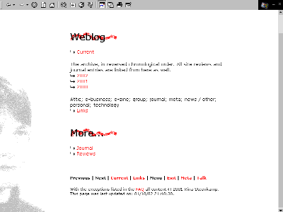
New background graphics for the weblog, the journal and the reviews section. I like it.

I'm using background graphics for the H1 tags for the first time, and I'm still a bit worried about how they'll look in other browsers / resolutions. They look fine in IE 4.0 and Opera 5.02.
Lesson learned: background-position : bottom left in combination with background-attachment : fixed won't work in Opera. IE 4.0 will stick the graphic at the bottom of the screen and keep it there as you scroll down, which is fine. Opera 5.02 will stick the background graphic at the bottom of the page and keep it there. That means that, with long pages, you're never going to see the background since it's positioned below the lower edge of your screen. You live and learn.
I got the background graphic by tweaking a pretty unattractive photograph of me that's on my employer's intranet site. I don't like having my picture taken, and usually it shows. It definitely does here.

I don't have any decent graphics programs. I used Microsoft's Photo Editor (which comes with Windows installations, at least with Windows 98) to reverse sides, enlarge the image and bleach the colors. I then made it black and white by saving it as an 8-bits black and white bitmap.
I used MS Paint to edit the image and cut off the half I didn't need. When working on a web page I usually let the style sheet point to the .bmp image that I'm working on, and I have the image open in MsPaint in one window and a browser with the webpage in another, refreshing after each change in the image.
A typical Windows installation will offer you three ways to convert a bitmap to .GIF format: "save as" in MsPaint (not very good, often changes the colors in the image); "save as" in Photo Editor (better, but can't seem to handle chrome in screen shots); and including the image in a Word document, saving the document as HTML (which converts the image to .GIF format), throwing away the converted Word document and renaming the .GIF it has created to the file name you want. For some reason the Word approach seems to yield the best results, so that's what I used.
I then used Spinwave's GIF cruncher to reduce the file size. The cruncher will optimize the image in a number of increments, using less colors and more dithering with each increment. I liked the look of the most compressed image that uses only grey and white, so that's the one I ended up using.
![]() GIF and JPEG cruncher
GIF and JPEG cruncher
On this page Transitional HTML 4.01 and CSS 1 are used. If you're seeing this text you either have CSS switched off in your browser, or you're using a browser that can't handle CSS. If you're using an older browser version, you might want to consider upgrading.